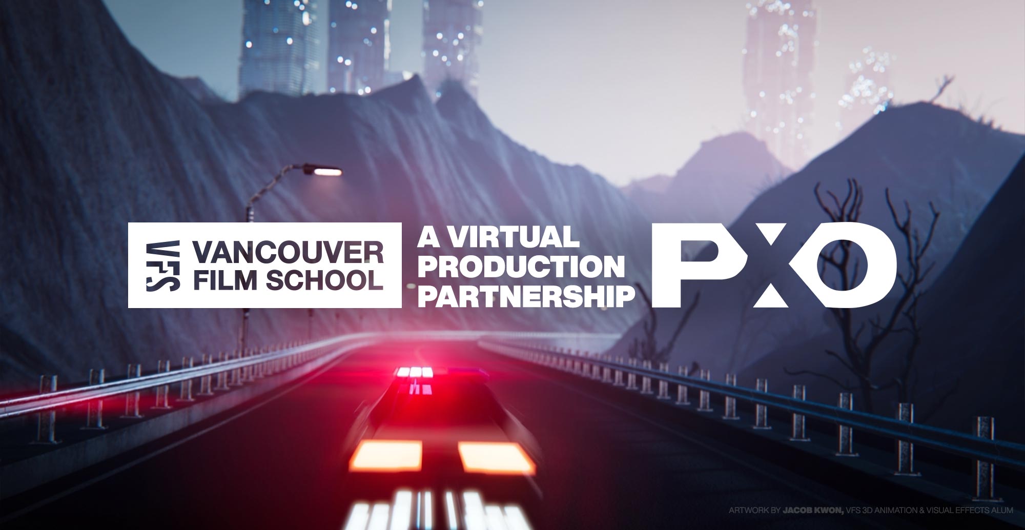
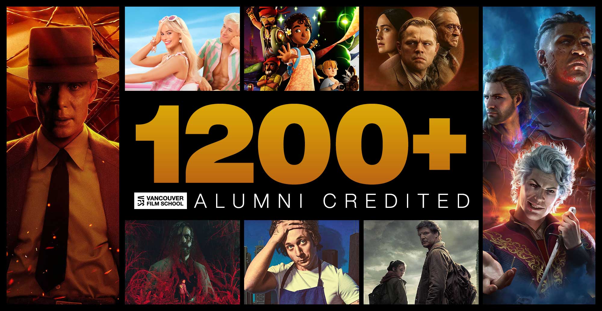
We’ve seen what happens when our Digital Design students let loose their motion graphics mojo on the subject of Typography. But what about the Print Designers?
“Generally, Digital Design students are given assets to work with to make a small book,” says Print Design and Typography Instructor Robin Mitchell. “In the past, we have worked with local award-winning publisher Simply Read Books. Simply Read Books has allowed us to use professionally prepared images and text for children’s books.”
“[This class] did a special version of the project,” she says: The ABCs of Typography.
The “special version of the project” spanned classes and even terms – the students created the basic assets of The ABCs of Typography in Typography class, and in the next term’s Print Design class, they all drew from that pool of assets to create the books, which were printed at school and bound professionally.
The results are simply stunning. In Robin’s words, they “did an exceptional job of sharing ideas and assets and produced a great array of well-designed books.”
“I think the most important lesson was that we can always learn from each other,” says former student – now grad – Andrea de Mattos Quaresma, “And different styles can always make you see your work in a different way.”
The challenge of housing such a diverse set of designs is one that most designers will face at some point, and the students tackled it head-on. “It wasn’t easy to find a way to relate such variety of styles in one single book,” says Andrea, “But it was fun to find solutions for each page and see how we could make them work together.”
And the students did have some room to breathe. According to Andrea’s classmate Everardo Iñiguez, “We had the option of changing aspects of each other’s work as long as the core concept remained.”
“My book was titled Typographique Abecedarium,” he says of his project, which became part of his semi-finalist entry in this year’s Adobe Design Achievement Awards. “[It] was designed so it could fit every asset without overshadowing the visual importance of each piece, but giving you enough information and a cohesive sense of collection.”
So, what did the students ultimately take away from this term-bridging project, apart from some really beautiful books?
Everardo: “The project was geared towards learning how to present and work with material from someone else, how to display it correctly, learn the balance of space and colour to achieve a strong piece and a well-designed environment for the collection of graphics, proper use of a grid and most importantly, working across programs.”
Andrea: “In a design agency, we can’t always do everything in our own way and we have to learn how to make the best use of what we have, and we learned that by putting this book together.”
To give you an idea of the breadth of the class’s work on the project – how they all approached the challenge differently – here’s Robin’s comments on a few:
Jadyn Aguilar – portfolio
Robin: Her book included an original set of illustrated characters with facial expression/mouth movements to indicate the pronunciation of each letter. She played with pattern and used a refined colour palette.
Ivan Cruz – portfolio | ABCs of Typography (pdf)
Robin: His book had a professional polish and restraint which was impressive. He used a restrained colour palette to unify contributions from his classmates.
Everardo Iñiguez – portfolio
Robin: His book incorporated more detailed information about each entry in the books. His book was packed with text and graphic imagery, without becoming too busy, confusing or disjointed. The result is cohesive, unique and playful.
Sae-Eun (Annie) Park – portfolio
Robin: She used an unusual book format (page proportion) and quite professional typesetting skills to create a professional and intelligent final book design.
Andrea de Mattos Quaresma – portfolio | Green on Type (pdf)
Robin: Her approach was bold, playful, and straightforward. She used colour, type, and scale effectively to produce a very friendly, approachable book.
All the online portfolios from that Digital Design class can be found here.
And some gorgeous pages from Andrea and Everardo’s books for comparison – Andrea created the illustration for ‘Justification’, while ‘X-height’ is Everardo’s:


Leave a comment
[...] You can see the full post here. [...]
Pingback by Dreamer Hoy | a blog of Annie Park » Blog Archive » ABCs of Typography09.06.08 @ 1:44 am
I downloaded some typography from youtube. I have been using it in my classroom to increase reading fluency. At the end of six weeks, 6 students had increased at a rate of 20 words or more per minute. The average for the remaining students averaged at least 13 words per minute. I want more typography, but I need it to be appropriate for 4th graders. Can you help me?
Comment by Karen Foerch04.06.09 @ 4:15 pm
[...] on VFS School [...]
Pingback by Vancouver film school presents: Typography… – Karol Zielinski’s Blog06.22.09 @ 3:17 am
[...] informações: http://www.vfs.com/blog/2008/06/26/abcs-of-typography/ [...]
Pingback by Conceitos de Tipografia « Faísca e Mostarda06.22.09 @ 7:23 am
[...] un programa digital. Se puede leer más sobre este impactante proyecto en el blog de la escuela (VFS Blog) sobran las palabras, mejor es ver el resultado de esta gran [...]
Pingback by Vídeo ABC de la tipografía | Caya oh!06.22.09 @ 10:11 am
Leave a comment
Line and paragraph breaks automatic, e-mail address never displayed, HTML allowed:
<a href="" title=""> <abbr title=""> <acronym title=""> <b> <blockquote cite=""> <cite> <code> <del datetime=""> <em> <i> <q cite=""> <strike> <strong>